Loading required package: timechange

Attaching package: 'lubridate'

The following objects are masked from 'package:base':

    date, intersect, setdiff, union
Code
data <-read.csv("dm_export_CA.csv")data$StartDate <-as.Date(data$StartDate)data$EndDate <-as.Date(data$EndDate)ggplot(data, aes(x = ConsecutiveWeeks)) +geom_histogram(bins =30, fill ="blue", color ="black") +theme_minimal() +labs(title ="Distribution of Consecutive Weeks", x ="Consecutive Weeks", y ="Frequency")
Code
county_data <- data %>%group_by(County) %>%summarise(TotalWeeks =sum(ConsecutiveWeeks)) %>%arrange(desc(TotalWeeks))
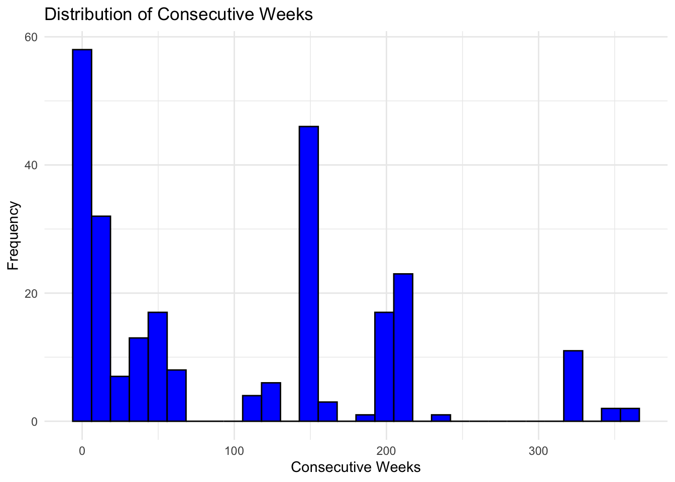
The distribution of consecutive weeks shows a right-skewed pattern, suggesting that shorter periods are more common than longer ones.
Code
ggplot(county_data, aes(x =reorder(County, TotalWeeks), y = TotalWeeks)) +geom_bar(stat ="identity", fill ="coral") +coord_flip() +labs(title ="Total Consecutive Weeks by County", x ="County", y ="Total Consecutive Weeks") +theme_minimal()
Code
data$Year <-year(data$StartDate)yearly_data <- data %>%group_by(Year) %>%summarise(TotalWeeks =sum(ConsecutiveWeeks))
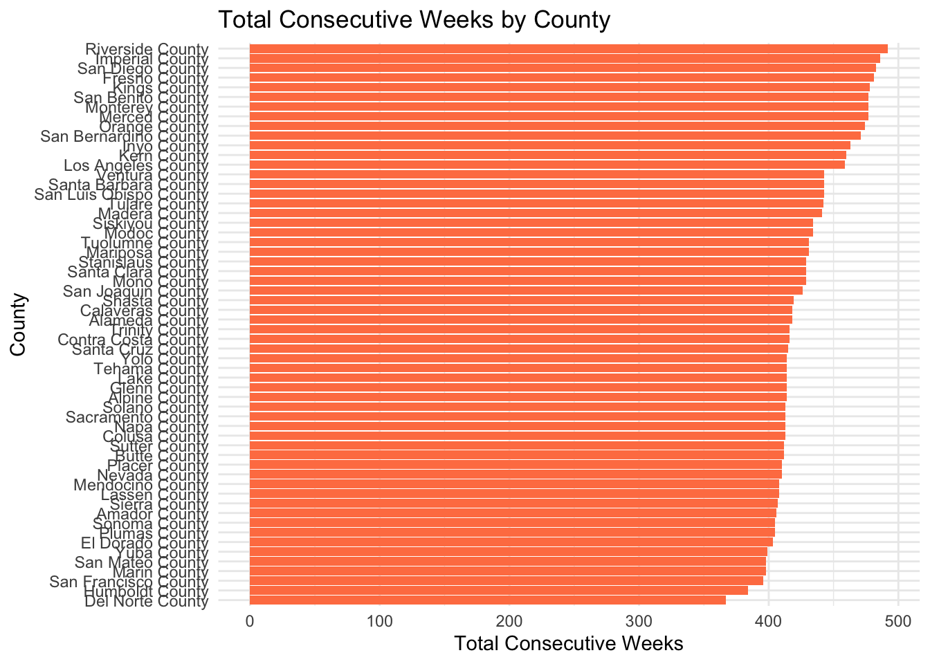
The bar chart displays all counties with the number of occurrences in the dataset. We can find in the period of 2013-2023, Riverside Country has experienced the longest drought, while Del Norte Country experienced the shortest one.
Code
ggplot(yearly_data, aes(x = Year, y = TotalWeeks)) +geom_line(group =1, color ="green") +labs(title ="Total Consecutive Weeks Over Time", x ="Year", y ="Total Consecutive Weeks") +theme_minimal()
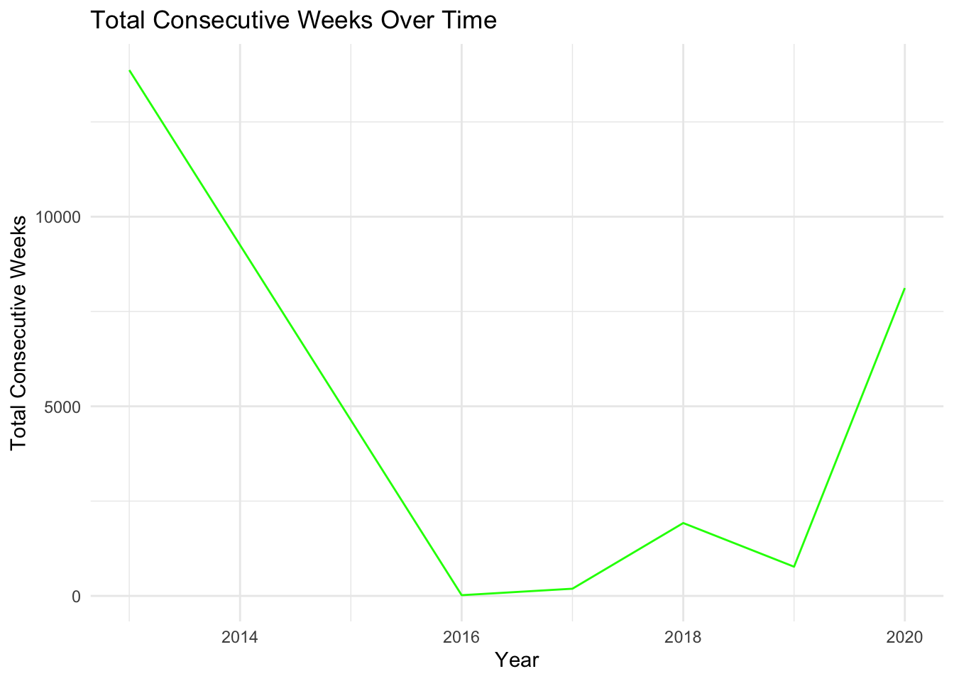
The line plot over time shows fluctuations in the number of occurrences per year. There is a visible trend or pattern over the years, but specific years like 2016 show lower activity than others.
##2
Code
data <-read.csv("events-CA.csv", skip =1) names(data) <-c("Name", "DisasterType", "BeginDate", "EndDate", "CostMillions", "Deaths")data$BeginDate <-ymd(data$BeginDate)data$EndDate <-ymd(data$EndDate)ggplot(data, aes(x = DisasterType)) +geom_bar(fill ="blue") +theme_minimal() +labs(title ="Frequency of Disaster Types", x ="Disaster Type", y ="Frequency")
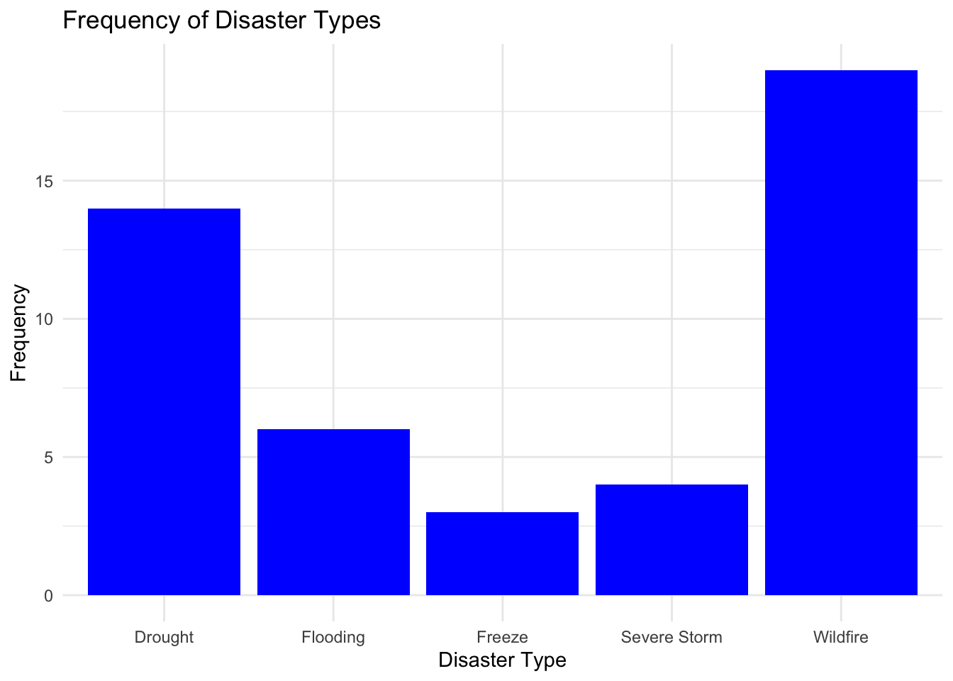
This plot shows how often each type of disaster occured in California between 1980 and 2023. We find that drought is the second most frequent, occurring much more frequently than flooding, freezes, and severe storms.
Code
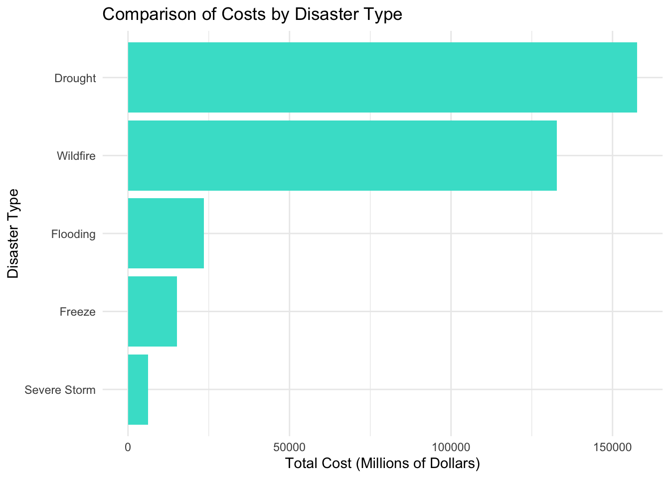
disaster_costs <- data %>%group_by(DisasterType) %>%summarise(TotalCost =sum(CostMillions, na.rm =TRUE)) %>%arrange(desc(TotalCost))ggplot(disaster_costs, aes(x =reorder(DisasterType, TotalCost), y = TotalCost)) +geom_bar(stat ="identity", fill ="turquoise") +coord_flip() +labs(title ="Comparison of Costs by Disaster Type", x ="Disaster Type", y ="Total Cost (Millions of Dollars)") +theme_minimal()
This graph compares the economic losses caused by different disasters, and it’s clear that drought causes the most damage.
Code
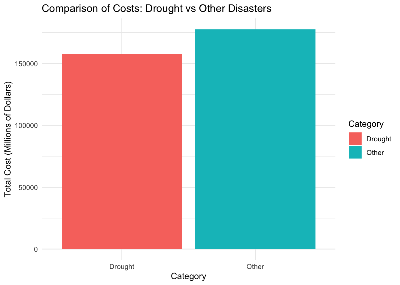
data$Category <-ifelse(data$DisasterType =="Drought", "Drought", "Other")category_costs <- data %>%group_by(Category) %>%summarise(TotalCost =sum(CostMillions, na.rm =TRUE))ggplot(category_costs, aes(x = Category, y = TotalCost, fill = Category)) +geom_bar(stat ="identity") +labs(title ="Comparison of Costs: Drought vs Other Disasters", x ="Category", y ="Total Cost (Millions of Dollars)") +theme_minimal()
This graph facilitates a better visualization of the economic losses caused by drought, which are nearly equal to the combination of other disasters.
##3
Code
data <-read.csv("USDM-California.csv")data$MapDate <-ymd(data$MapDate)data$drought_percentage =100- data$Noneggplot(data, aes(x = MapDate, y = drought_percentage)) +geom_line(color ="red") +labs(title ="Trend of the Percentage of California Experiencing Drought",x ="Date",y ="Drought Percentage (%)") +theme_minimal()
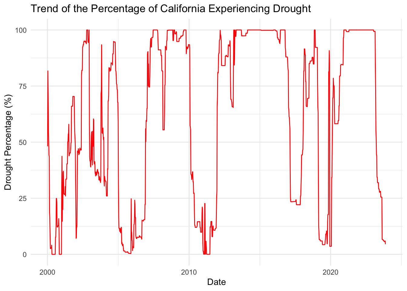
This graph shows the change in California’s drought area as a percentage of total area from 2013-2023. The drought area is changing dramatically, being high in individual years but low in others.
Code
data$Year =year(data$MapDate)data$Week =week(data$MapDate)ggplot(data, aes(x = Year, y = Week, fill = drought_percentage)) +geom_tile() +scale_fill_gradient(low ="white", high ="brown") +labs(title ="Heatmap of Drought Severity in California by Week and Year",x ="Year",y ="Week",fill ="Drought Severity (%)")
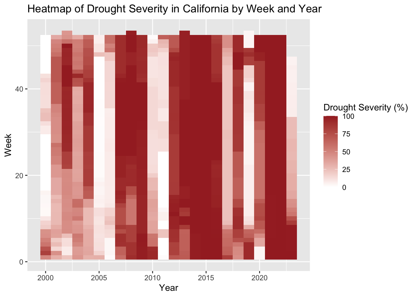
This graph shows the change in drought severity in the form of a heatmap, and the general trend is similar to the previous one
Code
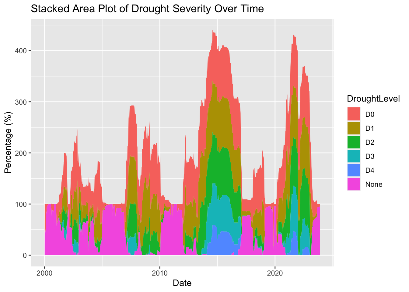
data_long <-pivot_longer(data, cols =c(None, D0, D1, D2, D3, D4), names_to ="DroughtLevel", values_to ="Percentage")ggplot(data_long, aes(x = MapDate, y = Percentage, fill = DroughtLevel)) +geom_area(position ='stack') +labs(title ="Stacked Area Plot of Drought Severity Over Time",x ="Date",y ="Percentage (%)")
This graph shows the trend of various drought levels over time.
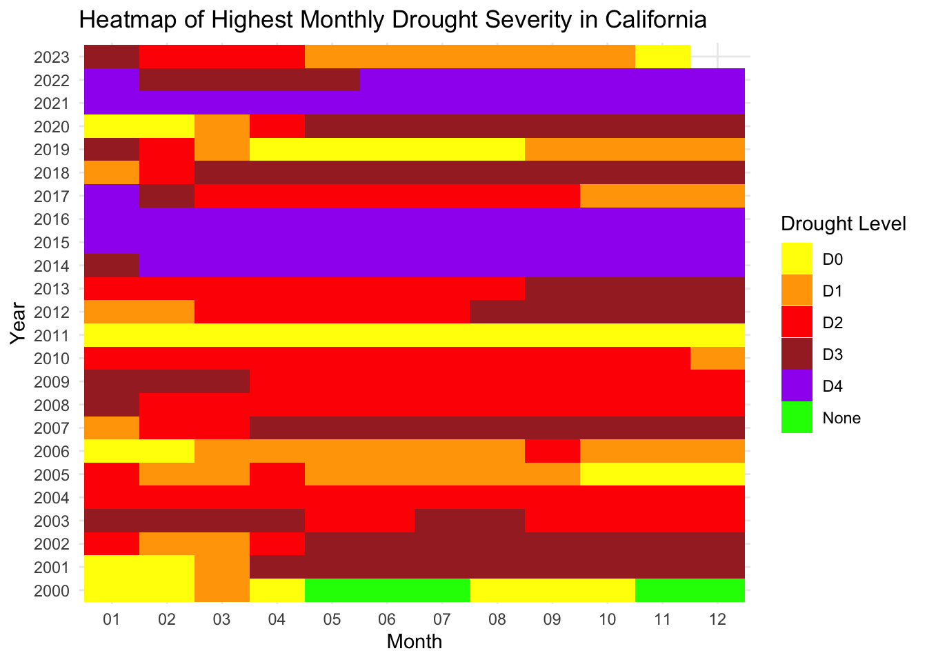
The heatmap visualizes the highest monthly drought severity in California over a span of years. Many consecutive rows of red to purple shades suggest prolonged severe drought conditions, while green indicates periods with minimal or no drought stress.